
An interview from “Zero Tolerance” magazine, 2014
I see on your website that your preferred medium is pen and ink with low key colour. Is that still the case? What is it about this medium that works for you?
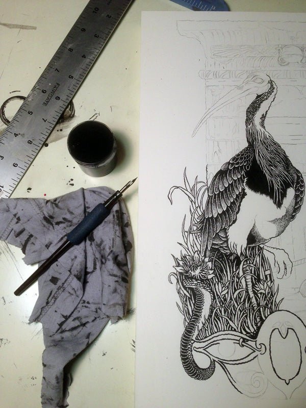
My work is usually seen in print form, which does call for a certain approach to color. Accessible reproduction tools like photocopying, screen printing, and letterpress have molded my general aesthetic, which for better or worse, relies heavily on the line work. Subtle earth tones usually compliment my work best and give the blackline room to breathe.
I appreciate that it’s not always easy to articulate, but how do you go about creating an illustration that harmonises most elegantly with the band you’re working with? Does any of it stem from a synaesthesic approach to listening?
Relationships vary. New ones usually start with a combination of initial ideas and studied sketches which are pared down to a workable composition. I do a lot of listening, digging into visual history, and sketching.
With bands that I am close with, such as Om, it’s a deep meditation on the essence of the band, humbly interpreted through my work. I am blessed to have their trust in my vision.
Synesthesia, a “union of the senses”, is a good word to describe a successful poster or album cover. My goal is that the image resonates with the listener’s experience within the music.
It seems as though meditation and deep listening feature heavily in your creation process. Is it important for you to feel a connection – spiritual or otherwise – with the band / artist that you’re working with?
The work that I feel this sort of connection to comprises the heart of my practice. The connection results in my most successful work both technically and spiritually.
That said, I consider myself not much different from a plumber or stone mason. Illustration is a trade and there are skills and processes that take a lifetime to hone. It’s honest and deeply fulfilling for me, though sometimes less about a spiritual connection and more about my skills as an Illustrator. I also love this part of the work.
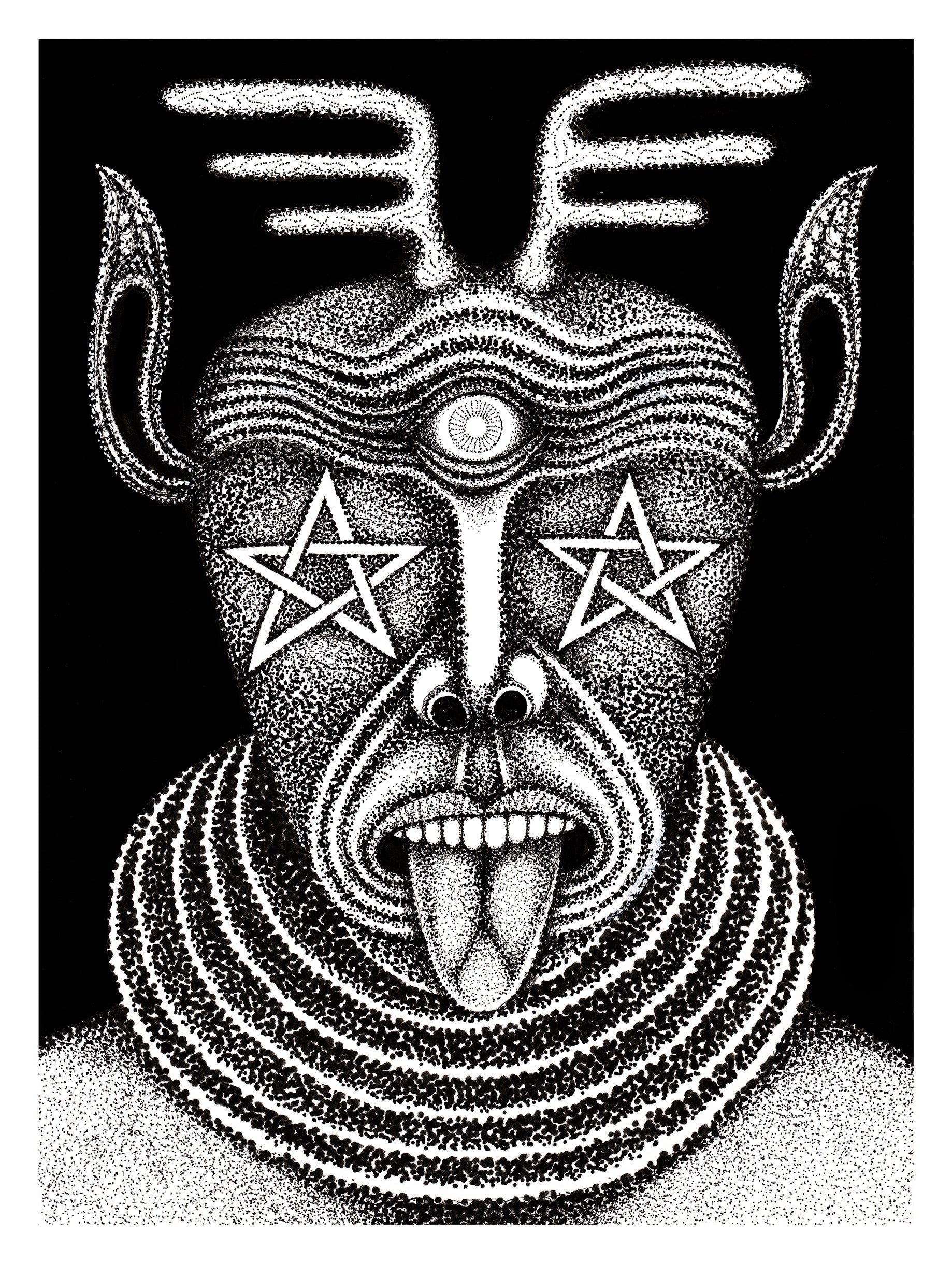
Images pertaining to death seem to feature heavily in your work, although it doesn’t feel morbid exactly – there’s something quite regenerative and harmonious about the presence of death within your drawings. What is the allure within this incorporation of death?
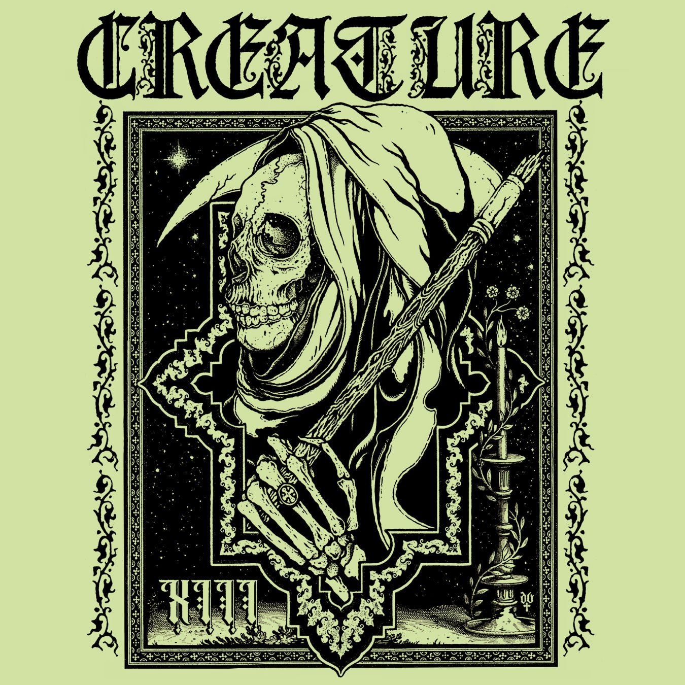
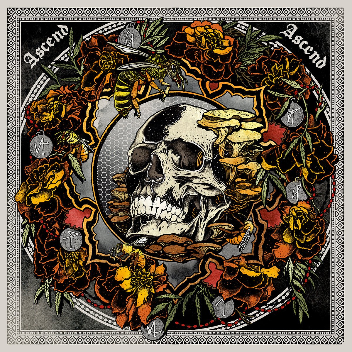
I consciously try to represent death in the memento mori tradition, a positive affirmation that death is inevitable and a reminder to fill your brief life with creativity and love.
When there is a skull in my artwork it represents a spiritual or ego death, which can be terrifying, but ultimately positive and life-affirming.
“The skull at the foot of my cross is my own.” Daniel A.I.U. Higgs.

 Are there any other recurrent images or ideas that you find yourself gravitating towards in particular?
You can detect threads in my work since my earliest stuff. I am very fond of the basics: death, rebirth, spirit as classically depicted by many artists and craftspeople over time. The cross is my favorite visual symbol both visually and historically.
There’s an awesome phrase on your website – the “psychedelia in nature”. In particular, those peacocks in the Om April 2014 tour poster come to mind as I read it. What is it about this idea that appeals to you?
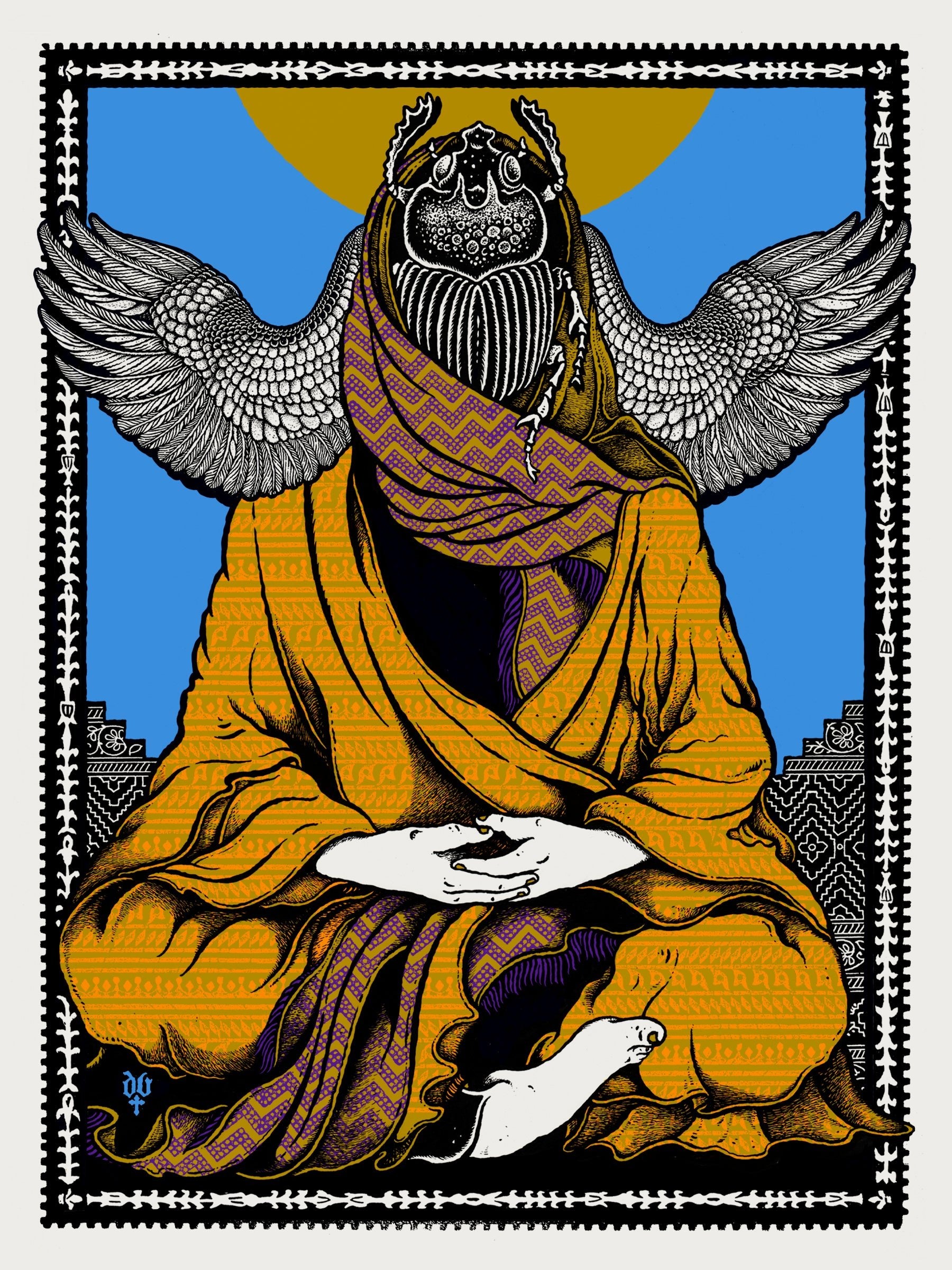
A peacock feather is a fantastic example of the patterns and infinite microcosm all around us. The markings of a feather can represent the resonance of a bass note. The stripes of a tiger describe a drum roll. Nature is the ultimate muse.
The Om poster is my variation of an Indian “Tree of Life”. Peacocks have layers and layers of meaning in art and religious history. The eye-like pattern of their feathers for example, or the fact that they are renewed each year, representing rebirth.
What does your studio look like? How have you arranged/furnished/decorated it to create the optimum environment for you to work in?
My studio is in an old woolen mill on the banks of the Willamette River. The St Johns bridge spans overhead leading to Portland’s Forest Park which is the largest urban forest in the country.
It’s important that my studio environment harbors creativity and a space out-of-time, a sacred environment of sorts. I surround myself with work of contemporaries, 60s posters, paper ephemera from the turn of the century, books, records, and religious oddities. A portion of my studio is devoted to housing my Chandler and Price letterpress (1910) and other archaic printing paraphernalia.

What’s on the horizon for you?
While cleaning and oiling joints on my press, I recently discovered that I can see some gold paint peeking out from beneath the top layer of black. In its time, 1910, decorative pinstriping of industrial printing equipment was in vogue. I am working on restoring the original decorative patterns to refurbish the press while retaining its incredible patina.
Beyond that, Om, Sleep, and my first in-house record release on Samaritan Press, Empty Tomb b/w Sepulcher Dub 7” by Al Cisneros.